
Master CSS Functions: The Ultimate Cheat Sheet for Modern Web Design
CSS functions are the backbone of dynamic, responsive, and visually engaging web design. Whether you’re calculating layouts, animating elements, or creating complex color schemes, understanding CSS functions unlocks endless creative possibilities. This guide serves as your ultimate cheat sheet, complete with practical examples, browser compatibility tips, and resources to streamline your workflow.
Key Points
- CSS functions help create dynamic, responsive, and visually engaging designs.
- Mathematical functions like
calc(),min(), andclamp()are essential for layout control. - Transform and filter functions add animations and visual effects to elements.
- Modern color functions offer more flexibility and precision, especially for accessibility and theming.
- Always check browser compatibility before using advanced or experimental functions.
Why CSS Functions Matter
CSS functions simplify complex tasks, reduce code redundancy, and enable responsive design. From fluid typography with clamp() to eye-catching gradients, these tools empower developers to build modern, adaptable interfaces. Let’s dive into key categories and their most impactful functions.
1. Math Functions: Precision & Flexibility
Math functions handle calculations directly in CSS, eliminating reliance on pre-processors.
| Function | Example | Description |
|---|---|---|
calc() | width: calc(100% - 20px); | Performs basic arithmetic calculations to determine property values. |
abs() | width: abs(-10px); | Returns the absolute value of a number. |
acos() | /* acos(0.5) returns an angle in radians */ | Returns the inverse cosine of a number (in the range -1 to 1). |
asin() | /* asin(0.5) returns an angle in radians */ | Returns the inverse sine of a number. |
atan() | /* atan(1) returns an angle in radians */ | Returns the inverse tangent of a number. |
atan2() | /* atan2(10, 5) calculates the angle from two numbers */ | Returns the inverse tangent of the quotient of its arguments. |
cos() | /* cos(45deg) calculates cosine */ | Returns the cosine of an angle. |
exp() | /* exp(1) returns Euler's number e^1 */ | Returns Euler’s number raised to the power of a given number. |
floor() | width: floor(10.7px); | Rounds a number downward to the nearest integer. |
log() | /* log(10) returns the natural logarithm of 10 */ | Returns the natural logarithm (base e) of a number. |
mod() | width: mod(10, 3); | Returns the remainder after division of one number by another. |
pow() | width: pow(2, 3); | Returns the base raised to the power of the exponent. |
round() | width: round(10.5px); | Rounds a number to the nearest integer (or specified precision). |
sin() | /* sin(30deg) calculates sine */ | Returns the sine of an angle. |
sqrt() | width: sqrt(16); | Returns the square root of a number. |
tan() | /* tan(45deg) calculates tangent */ | Returns the tangent of an angle. |
hypot() | width: hypot(3px, 4px); | Returns the square root of the sum of squares of its arguments. |
sign() | width: sign(-5); | Returns the sign of a number (−1, 0, or 1). |
min() | width: min(300px, 50%); | Returns the smallest (minimum) value from a comma‑separated list. |
max() | width: max(100px, 10vw); | Returns the largest (maximum) value from a list. |
clamp() | font-size: clamp(1rem, 2.5vw, 2rem); | Restricts a value between a defined minimum and maximum with an ideal value. |
Pro Tip: Use clamp() for adaptive spacing and typography. Check CanIUse for browser support.
If you’re looking for tools to improve your focus while working online, check out these 10 free Chrome extensions that can help boost productivity.
2. Transform Functions: Animation & Layout Control
Manipulate element positioning, scaling, and rotation.
| Function | Example | Description |
|---|---|---|
| translate() | transform: translate(10px, 20px); | Moves an element along the X and Y axes. |
| translateX() | transform: translateX(15px); | Moves an element horizontally. |
| translateY() | transform: translateY(15px); | Moves an element vertically. |
| translateZ() | transform: translateZ(30px); | Moves an element along the Z-axis (3D space). |
| translate3d() | transform: translate3d(10px, 20px, 30px); | Moves an element in three dimensions. |
| scale() | transform: scale(1.5); | Scales an element uniformly. |
| scaleX() | transform: scaleX(2); | Scales an element horizontally. |
| scaleY() | transform: scaleY(2); | Scales an element vertically. |
| scaleZ() | transform: scaleZ(1.2); | Scales an element along the Z-axis (3D space). |
| scale3d() | transform: scale3d(1.2, 1.2, 1.2); | Scales an element in three dimensions. |
| rotate() | transform: rotate(45deg); | Rotates an element by a given angle in 2D space. |
| rotateX() | transform: rotateX(30deg); | Rotates an element around its X-axis (horizontal rotation in 3D). |
| rotateY() | transform: rotateY(30deg); | Rotates an element around its Y-axis (vertical rotation in 3D). |
| rotateZ() | transform: rotateZ(30deg); | Rotates an element around its Z-axis (equivalent to rotate() in 2D). |
| rotate3d() | transform: rotate3d(1, 1, 0, 45deg); | Rotates an element around a vector in 3D space. |
| skew() | transform: skew(10deg, 20deg); | Skews an element along the X and Y axes. |
| skewX() | transform: skewX(15deg); | Skews an element horizontally. |
| skewY() | transform: skewY(15deg); | Skews an element vertically. |
| perspective() | transform: perspective(500px) rotateY(45deg); | Applies a perspective projection to create a 3D effect. |
| matrix() | transform: matrix(1, 0, 0, 1, 10, 20); | Defines a 2D transformation matrix (a, b, c, d, e, f). |
| matrix3d() | transform: matrix3d(1, 0, 0, 0, 0, 1, 0, 0, 0, 0, 1, 0, 10, 20, 30, 1); | Defines a 3D transformation as a 4×4 matrix. |
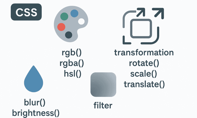
3. Color Functions: Modern Palettes & Accessibility
Move beyond hex codes with advanced color systems.
| Function | Example | Description |
|---|---|---|
| rgb() | color: rgb(255, 0, 0); | Defines a color using red, green, and blue values. |
| rgba() | color: rgba(255, 0, 0, 0.5); | Defines a color using RGB with an alpha (opacity) channel. |
| hsl() | color: hsl(0, 100%, 50%); | Defines a color using hue, saturation, and lightness. |
| hsla() | color: hsla(0, 100%, 50%, 0.5); | Defines a color using HSL with an alpha channel. |
| hwb() | color: hwb(0, 0%, 0%); | Defines a color using hue, whiteness, and blackness. |
| lab() | color: lab(50% 20 30); | Defines a color in the CIELAB color space. |
| lch() | color: lch(50% 30 20deg); | Defines a color in the LCH color space (lightness, chroma, hue). |
| oklab() | color: oklab(50% 0.1 0.2); | Defines a color in the OKLAB color space. |
| oklch() | color: oklch(50% 0.3 20deg); | Defines a color in the OKLCH color space. |
| color() | color: color(display-p3 1 0 0); | Specifies a color in a specified color space other than sRGB. |
| color-mix() | background: color-mix(in srgb, red 50%, blue); | Mixes two colors in a given color space by a specified ratio. |
| device-cmyk() | color: device-cmyk(0%, 100%, 100%, 0%); | Defines a CMYK color in a device-dependent way. |
| light-dark() | color: light-dark(white, black); | Returns one of two colors based on the user’s preferred color scheme. |
| color-contrast() | color: color-contrast(red, blue, green); | Chooses the color with the highest contrast relative to a base color. |
Newer options like oklch() and hwb() offer perceptually uniform color spaces. Always test with ColorA11y.
4. Gradient & Filter Functions: Visual Flair
Craft backgrounds and effects without image editors.
| Function | Example | Description |
|---|---|---|
| blur() | filter: blur(5px); | Applies a Gaussian blur to an element. |
| brightness() | filter: brightness(150%); | Adjusts the brightness of an element. |
| contrast() | filter: contrast(200%); | Adjusts the contrast between light and dark areas of an element. |
| drop-shadow() | filter: drop-shadow(3px 3px 5px black); | Applies a drop shadow effect that follows the shape of the element. |
| grayscale() | filter: grayscale(100%); | Converts an element’s colors to shades of gray. |
| hue-rotate() | filter: hue-rotate(90deg); | Rotates the hue of all colors in an element. |
| invert() | filter: invert(100%); | Inverts the colors of an element. |
| opacity() | filter: opacity(50%); | Adjusts the transparency of an element. |
| saturate() | filter: saturate(150%); | Adjusts the color saturation of an element. |
| sepia() | filter: sepia(100%); | Applies a sepia-tone filter to an element. |
Resource: Generate gradients instantly with CSS Gradient Generator.
5. Counter Functions
| Function | Example | Description |
|---|---|---|
| counter() | content: counter(section) "."; | Returns the current value of a CSS counter. |
| counters() | content: counters(section, ".") " "; | Returns a concatenated string of nested counters separated by a given string. |
6. Shape Functions
| Function | Example | Description |
|---|---|---|
| circle() | clip-path: circle(50% at 50% 50%); | Defines a circular clipping path for an element. |
| ellipse() | clip-path: ellipse(50% 25% at 50% 50%); | Defines an elliptical clipping path. |
| inset() | clip-path: inset(10% 20% 10% 20%); | Defines an inset rectangle as a clipping path. |
| polygon() | clip-path: polygon(50% 0%, 0% 100%, 100% 100%); | Creates a clipping path in the shape of an arbitrary polygon. |
| rect() | /* Deprecated: Use inset() instead */ | Defines a rectangle; deprecated in favor of inset(). |
| path() | clip-path: path('M0,0 L100,0 L100,100 Z'); | Defines a clipping path using an SVG path string. |
| xywh() | /* Example: xywh(10px, 20px, 100px, 50px) */ | Defines a rectangular shape using x, y, width, and height (less common). |
| ray() | /* Used with offset-path: ray(45deg, 50px); */ | Defines a line segment path for animations (experimental). |
7. Reference Functions
| Function | Example | Description |
|---|---|---|
| attr() | content: attr(data-info); | Retrieves the value of an HTML attribute for use in generated content. |
| env() | padding: env(safe-area-inset-top); | Inserts a user agent–defined environment variable (e.g. for notched devices). |
| url() | background-image: url("image.jpg"); | Specifies the URL of an external resource. |
| var() | color: var(--main-color, blue); | Inserts the value of a custom property (CSS variable), with an optional fallback value. |
8. Animation & Timing Functions
| Function | Example | Description |
|---|---|---|
| cubic-bezier() | transition-timing-function: cubic-bezier(0.25, 0.1, 0.25, 1); | Creates a custom timing function using a cubic Bézier curve for animations/transitions. |
| steps() | animation-timing-function: steps(4, end); | Creates a stepped timing function for animations, dividing the transition into a set number of steps. |
9. Miscellaneous / Advanced Functions
| Function | Example | Description |
|---|---|---|
| cross-fade() | background: cross-fade(url(img1.jpg), url(img2.jpg), 50%); | Blends two images together using a specified transparency (experimental). |
| element() | background-image: element(#myElement); | References another element as an image (part of CSS Houdini, experimental). |
| character-variant() | font-variant-alternates: character-variant(tabular-nums); | Selects alternate glyphs or stylistic sets for characters (used in advanced typography). |
| view() | animation-timeline: view(); | Select alternate glyphs or stylistic sets for characters (used in advanced typography). |
10. Best Practices & Compatibility
| Practice/Note | Example / Tip | Description |
|---|---|---|
| Use fallbacks | color: red; color: color(display-p3 1 0 0); | Always define a fallback for new color functions in case of unsupported browsers. |
| Check browser support | Can I use | Use reliable tools to check support for functions before using them in production. |
| Combine filters wisely | filter: blur(2px) brightness(120%); | Overusing filters can impact performance; combine them efficiently. |
Prefer clamp() | font-size: clamp(1rem, 2vw, 2rem); | Use clamp() instead of media queries when possible for responsive design. |
| Avoid experimental-only | color-contrast() | Avoid relying on features that are not yet standardized or widely supported. |
| Validate with tools | Use dev tools & linters | Use browser dev tools and linters like Stylelint to catch issues early. |
11. Advanced & Experimental Functions
| Function | Example | Description |
|---|---|---|
| color-contrast() | color: color-contrast(red vs blue, green); | Selects the color with highest contrast (still experimental in many browsers). |
| light-dark() | color: light-dark(white, black); | Selects the color with the highest contrast (still experimental in many browsers). |
| color-mix() | background: color-mix(in srgb, red 50%, blue); | Mixes two colors using a defined percentage in a color space. |
| lab(), lch() | color: lch(70% 60 20deg); | Defines colors using perceptually uniform models (advanced use). |
| oklab(), oklch() | color: oklch(70% 0.2 30deg); | Newer color spaces aiming for better visual accuracy. |
| device-cmyk() | color: device-cmyk(0%, 100%, 100%, 0%); | Newer color spaces aim for better visual accuracy. |
For anyone struggling with distractions, these 10 free Chrome extensions are a game-changer in enhancing focus and improving workflow.
Tips
- Use
clamp()to simplify responsive typography without media queries. - Combine
filter()functions carefully to maintain performance. - Add fallbacks for modern color functions to support older browsers.
- Test animations and transformations across devices to ensure smooth experience.
- Use
color-contrast()andlight-dark()for better accessibility in dark/light modes.
Final Thoughts
CSS functions are powerful tools that take your styling to the next level.
By learning how to use them effectively, you can build responsive layouts, enhance user interaction, and improve accessibility.
Whether you’re designing buttons or building full themes, mastering these functions will give you a solid edge as a front-end developer.
Frequently Asked Questions (FAQs)
1. What are CSS functions and why are they important?
Answer:
CSS functions are built-in operations that allow you to manipulate properties like size, position, colors, and effects dynamically. They are important because they help create more flexible and efficient layouts, animations, and design elements without needing extra code or media queries.
2. Can I use CSS functions in all browsers?
Answer:
Not all CSS functions are supported in every browser. It’s essential to check browser compatibility, especially for newer or experimental functions like color-mix() or color-contrast(). Tools like “Can I Use” can help ensure the functions you’re using are supported in the majority of browsers.
3. How can I make my website responsive using CSS functions?
Answer:
CSS functions like clamp(), calc(), and min()/max() allow you to create responsive designs that adapt to different screen sizes. For example, clamp() can be used to adjust font sizes dynamically based on the viewport size, reducing the need for media queries.
4. What is the difference between rgb() and rgba()?
Answer:rgb() defines colors using red, green, and blue values while rgba() extends rgb() by adding an alpha (opacity) channel. The alpha channel allows you to control the transparency of a color, making it useful for semi-transparent elements.
5. How do I use CSS transformations and animations effectively?
Answer:
CSS transformations, like rotate(), scale(), and translate(), help manipulate an element’s position, size, and shape. Pairing them with CSS animations or transitions can create interactive effects like hover states. Always test performance to ensure a smooth user experience.
6. Are CSS functions more efficient than using JavaScript for visual effects?
Answer:
Yes, CSS functions are generally more efficient for visual effects than JavaScript because they are processed directly by the browser’s rendering engine. CSS animations and transitions can offload the work to the GPU, improving performance, especially for animations and visual effects on the page.